
Hello again!
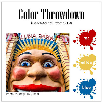
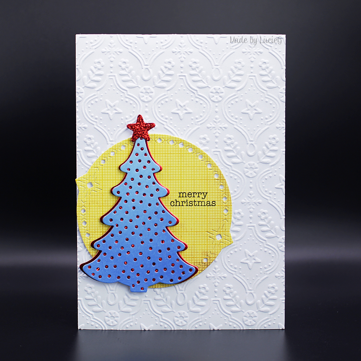
Next up today is my entry in this week’s Color Throwdown challenge which has a primary combo of red, yellow and blue. One of my very first entries into the Color Throwdown was for this very combo in 2016, before I had this blog, but I did create this card for another primary combo in 2021. I have to confess that I find this combo very challenging and I was going to skip it until I saw the little chubby tree card I created a few weeks ago which combined an aqua/blue tree and red pearls… and so I was inspired to get crafty!
 I saw a card using the Stampin’ Up Decorative Trees on Instagram in mid September. I rarely buy from Stampin’ Up partly because I’ve found their dispatch to be very slow and I’m very impatient for new goodies. But I liked the trees so much that I said that I would get them the next time I spotted an offer on shipping. I checked and there was a post for free shipping the very next day! I could not believe it! And to top it off, the order was actually shipped two days later!
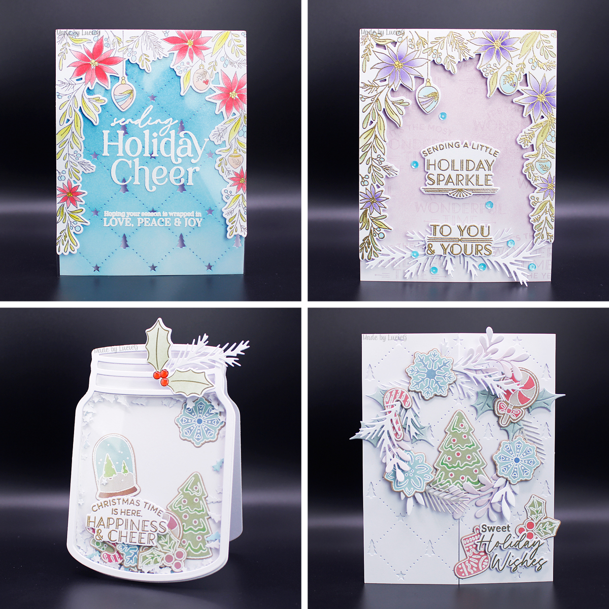
Anyway, I used a couple of tree dies for this card, together with a circle die from The Greetery and a Spellbinders embossing folder.
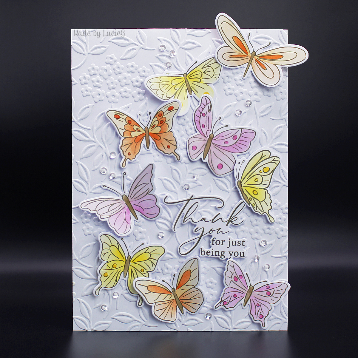
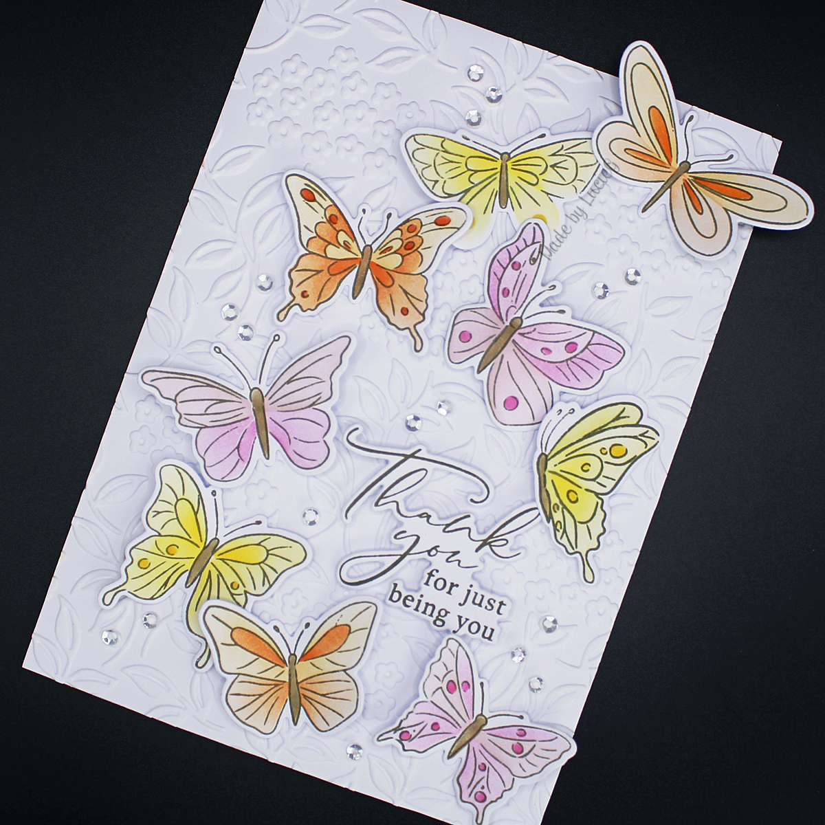
The sentiment is by Mama Elephant.
Thanks for stopping by!
LucieG.