Good morning everyone!
This week, I have the honour of being the Guest Designer over at one of my favourite challenges – the Color Throwdown Challenge. Funny story – I was last the GD for their challenge a year ago today!
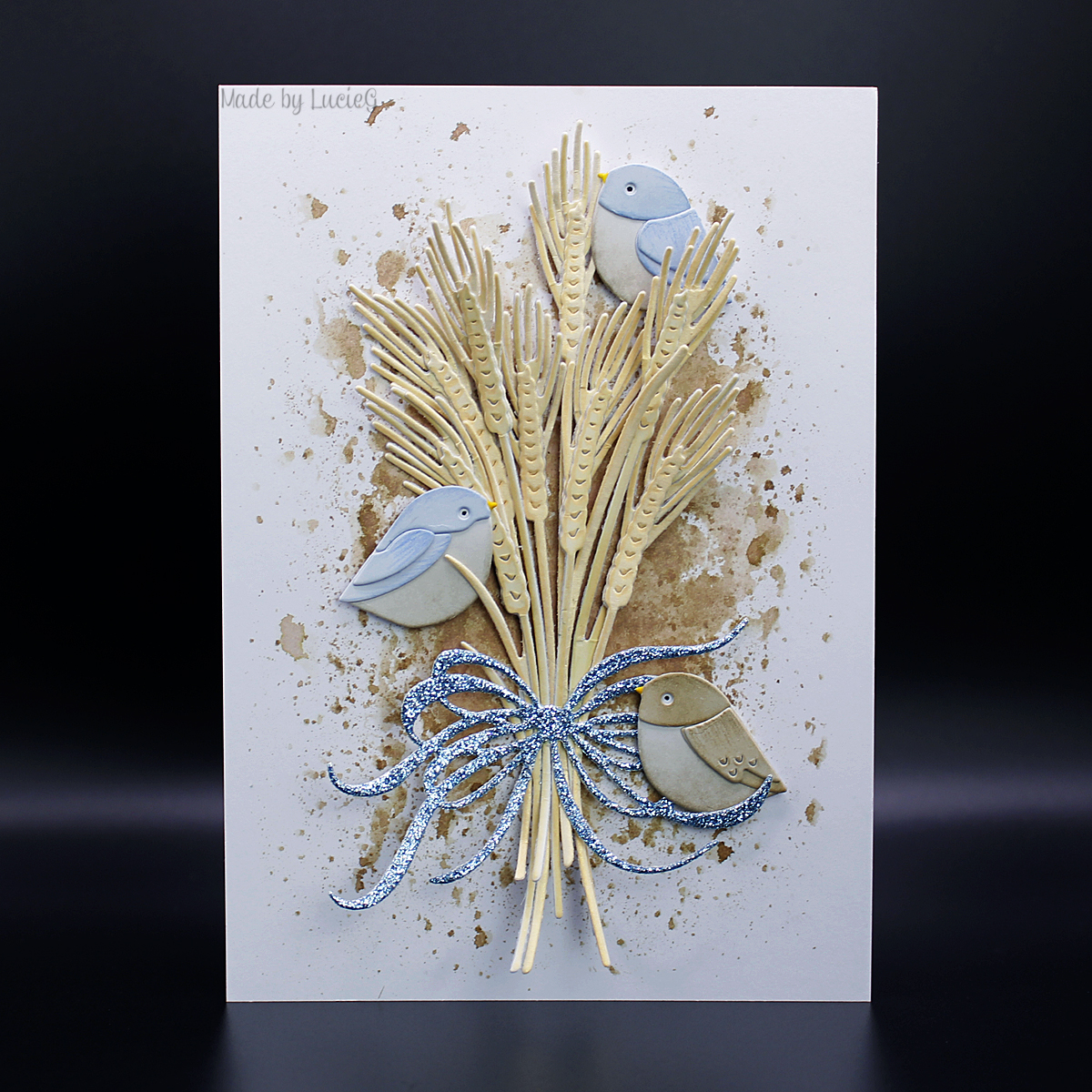
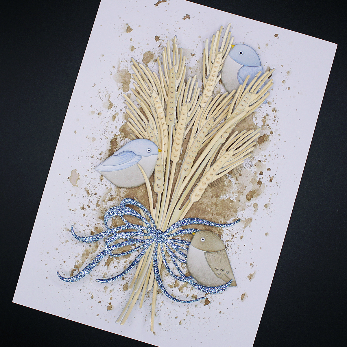
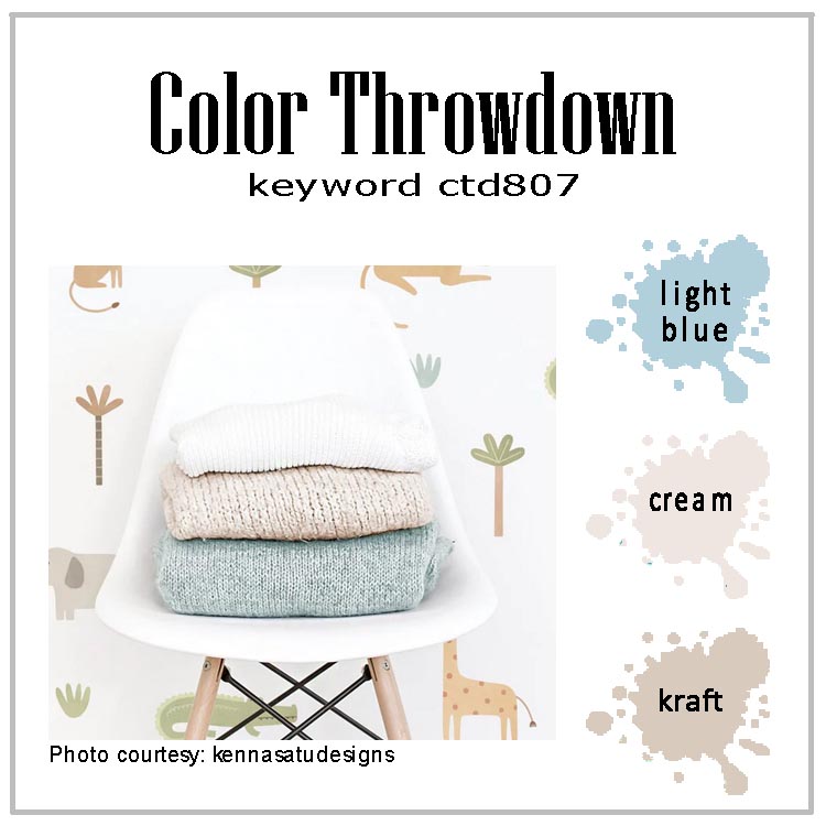
The palette for this challenge is light blue, cream and kraft, a fab combo! I was originally going to create a bouquet/vase combo but then I changed my mind!
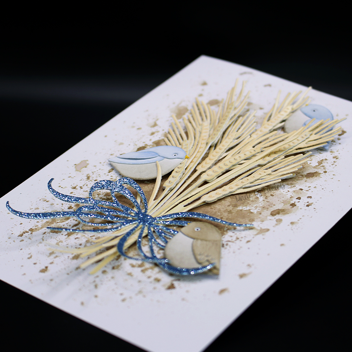 Instead, I pulled out The Greetery’s Wheat botanicuts set and cut it from white regular card and cream pearlescent card. I coloured the white card with Antique Linen distress oxide ink and I dusted the pearlescent card with the same ink for extra depth of colour. I mixed the two types of card when assembling the heads of the wheat stems.
I arranged the wheat into a bundle and added a blue glittery bow from the Fit to be Tied die set. I then smooshed some Frayed Burlap distress ink onto a white card base and adhered the bundle on top.
I felt that the card needed a little more blue so I added some birds from the Simon Says Stamp Layered Bird Bunch set. They are coloured with Stormy Sky, Frayed Burlap and Pumice Stone distress inks.
There’s some amazing inspiration from the Color Throwdown DT over on the challenge blog – I do hope you can play along this week!
Thanks for stopping by!
LucieG.

That looks amazing!
LikeLike